
CSS Flexbox: Layout Guide and Practice
One of the most frequent CSS layout questions is:
Explain how Flexbox works under the hood. How do flex-grow, flex-shrink, and flex-basis interact to determine the final size of a flex item? Provide the step-by-step arithmetic.
Flexbox (Flexible Box Layout) is a one-dimensional layout model designed to distribute space along a single axis (either horizontally or vertically) and align items dynamically inside a container, even when their sizes are unknown or dynamic.
To answer this comprehensively, you need to understand:
- Main Axis vs. Cross Axis: The spatial framework.
- Parent Container Properties: Layout flow and wrapping.
- Flex Item Sizing (The Flex Trinity): Sizing mechanics (
grow,shrink,basis). - Calculations: Step-by-step math for flex growth and shrinkage.
- Common Layout Patterns: Practical frontend interview code problems.
1. Main Axis vs. Cross Axis
Flexbox aligns items along two axes. The directions of these axes depend on the parent container's flex-direction property:
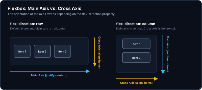
- Main Axis: The primary axis along which flex items are laid out. Sizing along this axis is governed by the items' flex properties and aligned using
justify-content. - Cross Axis: The perpendicular axis to the main axis. Alignment along this axis is governed by
align-items(on the container) andalign-self(on individual items).
2. Parent Container Properties
Set display: flex or display: inline-flex on the parent to create a flex context.
flex-direction: Sets the main axis (row[default],row-reverse,column,column-reverse).flex-wrap: Toggles whether items wrap onto multiple lines if container space runs out (nowrap[default],wrap,wrap-reverse).justify-content: Aligns items along the main axis (flex-start,flex-end,center,space-between,space-around,space-evenly).align-items: Aligns items along the cross axis for the current row track (stretch[default],flex-start,flex-end,center,baseline).align-content: Aligns multi-line flex rows along the cross axis when wrapping occurs (stretch,flex-start,flex-end,center,space-between,space-around).
3. Flex Item Sizing: The Flex Trinity
Sizing on a flex child is controlled by three properties, often combined into the shorthand: flex: [flex-grow] [flex-shrink] [flex-basis].
A. flex-basis
Defines the initial size of the flex item before any free space is distributed.
- Default:
auto(the browser looks at the item'swidth/heightproperty or defaults to content size). - Can be set to explicit units (e.g.
200px,20%) or0(which ignores the content width during space calculation).
B. flex-grow
Defines the item's ability to grow if there is positive remaining space in the flex container.
- Default:
0(items will not grow to fill remaining space). - Values are unitless proportions (e.g.,
flex-grow: 2will grow twice as much asflex-grow: 1).
C. flex-shrink
Defines the item's ability to shrink if the container's space is smaller than the sum of all items' initial flex-basis values (preventing container overflow).
- Default:
1(items shrink proportionally to prevent overflow). - Setting
flex-shrink: 0prevents the item from shrinking below its initial content size, causing it to overflow the container if space is insufficient.
4. Space Distribution Calculations (The Arithmetic)
A senior candidate is expected to explain exactly how browser layout engines calculate final dimensions under two scenarios: Positive Free Space (growing) and Negative Space (shrinking).
Scenario A: Growing (Positive Free Space)
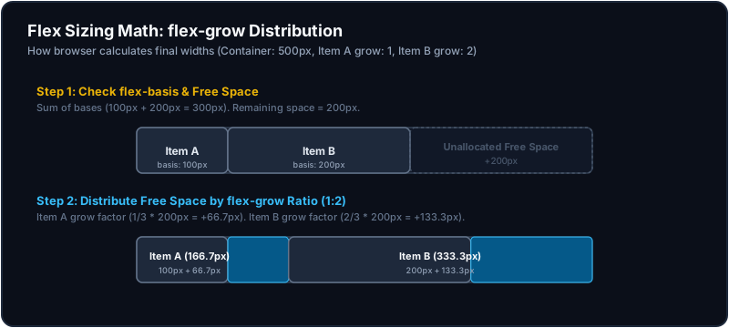
Suppose we have a container with a width of 500px containing two items:
- Item A:
flex-basis: 100px,flex-grow: 1 - Item B:
flex-basis: 200px,flex-grow: 2
Sizing Step-by-Step:
- Calculate Initial Space: Sum of items' basis = 100px + 200px = 300px.
- Calculate Remaining Free Space: Container Width - Initial Space = 500px - 300px = 200px.
- Calculate Growth Units: Total grow factors = 1 + 2 = 3.
- Distribute Space:
- Item A gets: (1 / 3) * 200px = 66.67px. Final Width = 100px + 66.67px = 166.67px.
- Item B gets: (2 / 3) * 200px = 133.33px. Final Width = 200px + 133.33px = 333.33px.
Scenario B: Shrinking (Negative Space / Overflow)
Suppose we have a container with a width of 300px containing two items:
- Item A:
flex-basis: 100px,flex-shrink: 1 - Item B:
flex-basis: 300px,flex-shrink: 3
Since the sum of bases (400px) exceeds the container width (300px), the browser must shrink the items to fit, distributing 100px of negative space (overflow).
Sizing Step-by-Step:
Unlike grow calculations (which look only at grow ratios), shrink calculations multiply the shrink factor by the item's basis size to prevent larger elements from shrinking disproportionately fast.
- Calculate Weighted Shrink Total:
- Weighted Total = Sum of (basis * shrink factor)
- Weighted Total = (100px * 1) + (300px * 3) = 100 + 900 = 1000.
- Calculate Shrink Ratios:
- Item A: (100 * 1) / 1000 = 10% of total shrink weight.
- Item B: (300 * 3) / 1000 = 90% of total shrink weight.
- Distribute Shrink Amount (100px Overflow):
- Item A shrinks by: 10% * 100px = 10px. Final Width = 100px - 10px = 90px.
- Item B shrinks by: 90% * 100px = 90px. Final Width = 300px - 90px = 210px.
5. Practical Interview Layout Exercises
Exercise A: Vertical & Horizontal Centering
A classic baseline layout test: center a box both horizontally and vertically inside a full-viewport container.
.viewport-centered-container {
  display: flex;
  justify-content: center; /* Centering along main axis (horizontal) */
  align-items: center;     /* Centering along cross axis (vertical) */
  min-height: 100vh;       /* Ensure container fills the viewport height */
}
Exercise B: Sticky Footer Layout
Ensure a footer stays at the bottom of the viewport when content is short, but pushes down naturally if content grows.
<div class="page-container">
  <header>Header Content</header>
  <main class="page-body">Main Content Area</main>
  <footer>Footer Content</footer>
</div>
.page-container {
display: flex;
flex-direction: column;
min-height: 100vh;
}
.page-body {
flex-grow: 1; /* Automatically consumes all remaining vertical space, pushing footer down */
}Key Takeaways
- One-Dimensional Design: Use Flexbox when aligning content items sequentially in a row or column (e.g., lists, buttons, small forms).
- Axis Swap: If
flex-directionchanges, the main and cross axes swap roles instantly. Always keep track of what axisjustify-contentvs.align-itemsis targeting. - Sizing Priority:
flex-basissets the starting size.flex-growhandles extra positive container space.flex-shrinkhandles negative container overflow using weighted basis ratios.