
CSS Grid: Layout Guide and Practice
One of the most common CSS interview questions for layouts is:
Explain the core concepts of CSS Grid. How do auto-fit and auto-fill differ, and how does the browser calculate track sizes with fractional (fr) units?
CSS Grid Layout is a powerful two-dimensional layout system that allows you to align content simultaneously along horizontal columns and vertical rows.
To answer this comprehensively, you need to understand:
- Grid Anatomy: Tracks, cells, lines, and areas.
- Track Sizing: Fractional (
fr) units,minmax(), and dynamic resizing. - Auto-fit vs. Auto-fill: Distributing items inside responsive grids.
- Implicit vs. Explicit Grid: How the grid handles overflow items.
- Practical Implementation: Coding a multi-device holy grail layout.
1. Anatomy of CSS Grid Layout
Before styling grid layouts, you must understand the vocabulary of the Grid specification. A grid is a collection of horizontal and vertical grid lines that intersect to form cells.
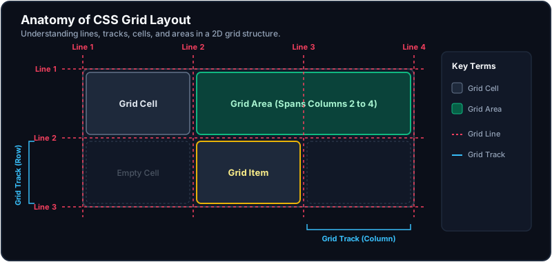
- Grid Track: The space between two adjacent row or column lines (representing columns or rows).
- Grid Cell: A single unit of the grid (the intersection of one row track and one column track).
- Grid Line: The divider lines that form the grid structure (indexed starting from
1). - Grid Area: The total space enclosed by any four grid lines. A Grid Area can span multiple rows and columns.
2. Parent Container & Track Sizing
Define a grid by setting display: grid or display: inline-grid on the container.
A. Sizing Tracks: The fr Unit
The fractional (fr) unit represents a portion of the flexible space remaining after all non-flexible tracks (such as pixels, percentages, or content sizing) have been allocated.
Track Sizing Math:
Suppose you define a layout with the following tracks:
.container {
  display: grid;
  width: 900px;
  gap: 20px; /* 2 gaps of 20px = 40px */
  grid-template-columns: 200px 1fr 2fr;
}
How does the browser calculate the width of the 1fr and 2fr columns?
- Calculate allocated space: Fixed track (200px) + Gaps (40px) = 240px.
- Calculate remaining space: 900px - 240px = 660px.
- Sum the fractional units: 1fr + 2fr = 3 units.
- Determine value of 1fr: 660px / 3 = 220px.
- Assign column widths:
- Column 1:
200px(Fixed) - Column 2:
220px(1fr) - Column 3:
440px(2fr)
- Column 1:
B. Minmax and Fit-Content
minmax(min, max): Defines a size range. The track size can grow between the minimum and maximum constraints (e.g.,minmax(150px, 1fr)).fit-content(max): Clamps track sizes. The track behaves asauto(sizing to its content), but won't grow larger than the specified maximum constraint (e.g.,fit-content(300px)).
3. Responsive Column Distribution: auto-fit vs. auto-fill
A favorite senior CSS interview question is how these keywords behave inside a repeat(auto-*, minmax()) statement:
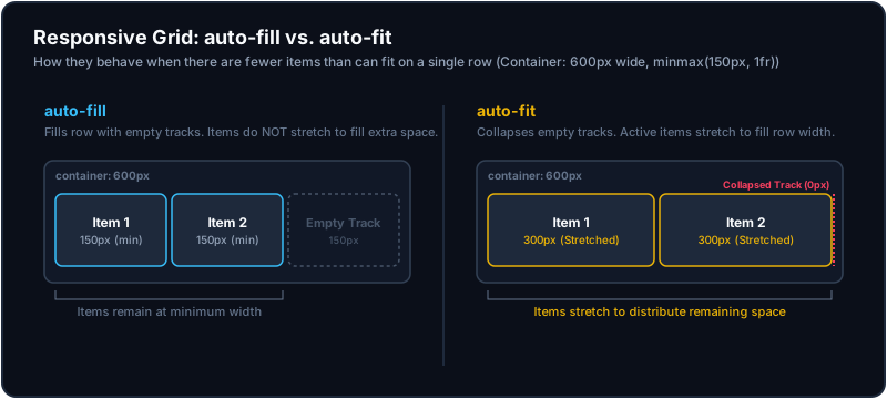
grid-template-columns: repeat(auto-fit, minmax(150px, 1fr));Both keywords distribute grid items dynamically based on width limits, but they behave differently when there are fewer items than can fill a single row:
A. auto-fill
Fills the row with as many grid tracks as possible, even if the tracks are empty. If there is extra space, empty invisible tracks are created, and the active items do not stretch to occupy the full width.
B. auto-fit
Fills the row with tracks, but collapses any empty tracks to 0px. The remaining active items stretch (via 1fr) to distribute and fill the entire available container width.
4. Explicit vs. Implicit Grid
Understanding the difference between the explicit and implicit grid is key for dynamic layouts:
- Explicit Grid: The columns and rows you manually define using
grid-template-columnsandgrid-template-rows. - Implicit Grid: The rows or columns automatically created by the browser when there are more grid items than cells in the explicit grid, or when an item is placed outside the explicit boundaries.
You can control sizing and direction of the implicit grid using:
grid-auto-rows: Sizes automatically generated implicit row tracks (e.g.,grid-auto-rows: minmax(100px, auto)).grid-auto-columns: Sizes automatically generated implicit column tracks.grid-auto-flow: Determines whether implicit items are appended by adding new rows (row) or new columns (column).
5. Practical Walk-through: Holy Grail Layout
Here is a modern, responsive implementation of a web app dashboard shell utilizing grid-template-areas.
<div class="app-layout">
  <header class="app-header">Header</header>
  <nav class="app-nav">Navigation</nav>
  <main class="app-content">Main Content</main>
  <aside class="app-sidebar">Right Sidebar</aside>
  <footer class="app-footer">Footer</footer>
</div>
/* Mobile First Layout (Single Column Stack) */
.app-layout {
display: grid;
grid-template-columns: 1fr;
grid-template-rows: auto auto 1fr auto auto;
grid-template-areas:
"header"
"nav"
"content"
"sidebar"
"footer";
min-height: 100vh;
gap: 1rem;
}
.app-header { grid-area: header; }
.app-nav { grid-area: nav; }
.app-content { grid-area: content; }
.app-sidebar { grid-area: sidebar; }
.app-footer { grid-area: footer; }
/* Desktop View (3-Column Layout) */
@media (min-width: 768px) {
.app-layout {
grid-template-columns: 200px 1fr 220px;
grid-template-rows: 80px 1fr 60px;
grid-template-areas:
"header header header"
"nav content sidebar"
"footer footer footer";
}
}Key Takeaways for Interviews
- Two-Dimensional Control: Grid controls column alignment and row spacing simultaneously.
- Fractional Units:
1frtakes a slice of the pie after all fixed margins, padding, gaps, and absolute/pixel widths have been carved out. - auto-fit vs. auto-fill: Use
auto-fitfor card galleries to ensure cards stretch to fill row width when there are few items. Useauto-fillwhen columns should maintain fixed dimensions regardless of item count. - Area Templates:
grid-template-areasis highly recommended for page layouts because it acts as visual documentation right inside your CSS file, and can be completely rearranged inside standard media queries.