
Flexbox vs. CSS Grid: Key Differences and Best Practices
In frontend engineering interviews, a common architectural and layout question is:
When should you use Flexbox over CSS Grid, and vice versa? How do they differ under the hood?
To answer this comprehensively, you need to understand:
- Dimensionality: One-dimensional (Flexbox) vs. Two-dimensional (Grid) layouts.
- Design Approach: Content-first (Flexbox) vs. Layout-first (Grid).
- Alignment & Spacing: How axis alignment differs in each layout model.
- Layout Calculations: Browser performance and rendering implications.
- Practical Scenarios: Real-world design patterns that combine both tools.
1. Dimensionality: 1D vs. 2D
The primary technical difference is the dimensions in which they operate:
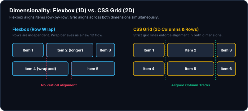
- Flexbox (Flexible Box Layout) is designed for one-dimensional layouts. It handles content either in a row or in a column at a single time. Even when items wrap onto a new line (
flex-wrap: wrap), each wrapped row acts as a completely independent layout container. Items in Row 2 have no awareness of and do not align with the column boundaries of Row 1. - CSS Grid is designed for two-dimensional layouts. It defines a rigid columns and rows structure simultaneously. Grid items strictly align horizontally and vertically across all grid tracks.
2. Content-First vs. Layout-First
Their layout philosophies define how components adapt to content changes:
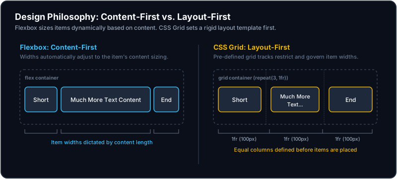
- Flexbox is Content-First: You let the size of the items dictate their placement and sizing. The parent container distributes space, but the individual child items define their own dimensions using
flex-grow,flex-shrink, andflex-basis. It is highly dynamic and adapts naturally to variable content size (e.g., tags, buttons, menus). - CSS Grid is Layout-First: You define the grid structure (columns and rows) on the parent container first using properties like
grid-template-columnsandgrid-template-rows. Individual child items are then positioned into those predefined grid cells. The layout container dictates the child sizes, forcing text to wrap or truncate to preserve grid alignment.
3. Technical Comparison
| Feature | Flexbox | CSS Grid |
|---|---|---|
| Dimension | 1D (Row OR Column) | 2D (Row AND Column) |
| Philosophy | Content-first (Dynamic sizes) | Layout-first (Rigid track structures) |
| Parent Rules | display: flex | display: grid or display: inline-grid |
| Child Controls | flex: grow shrink basis | grid-column, grid-row, grid-area |
| Wrapping | Row wraps start independent layout units | Wraps strictly into next grid cell row |
| Overlapping | Impossible without negative margins or absolute position | Built-in via grid coordinates (grid-column: 1 / 3; grid-row: 1 / 2) |
| Use Cases | Navbars, buttons, lists, single-line tags | Dashboards, galleries, page skeletons, table-like structures |
4. Axis and Alignment Properties
Both models use properties defined in the CSS Box Alignment Specification, but apply them differently based on their axes.
A. Flexbox Alignment
The main axis is determined by flex-direction (default is row). The cross axis runs perpendicular to it.
justify-content: Aligns items along the Main Axis (e.g.,flex-start,center,space-between).align-items: Aligns items along the Cross Axis (e.g.,stretch,center,baseline).align-self: Allows an individual flex child to override the parent'salign-itemsalignment.
B. CSS Grid Alignment
Alignment acts on two fixed dimensions: the inline (horizontal) axis and the block (vertical) axis.
justify-items/justify-self: Aligns items horizontally inside their respective grid tracks.align-items/align-self: Aligns items vertically inside their respective grid tracks.justify-content: Aligns the entire grid track system horizontally within the grid container.align-content: Aligns the entire grid track system vertically within the grid container.
5. Practical Interview Scenarios & Code Examples
Scenario A: Navigation Header (Use Flexbox)
A header requires a logo on the left, navigation links in the center, and a profile icon on the right. Sizing is based entirely on the text labels, and elements wrap gracefully on smaller viewports.
.navbar {
  display: flex;
  justify-content: space-between;
  align-items: center;
  padding: 1rem 2rem;
}

.nav-links {
  display: flex;
  gap: 1.5rem;
}
Scenario B: Responsive Dashboard Grid (Use Grid)
A responsive dashboard container displays cards that must align perfectly in columns and rows. When screen width shrinks, cards wrap to form a new row while keeping equal column spacing.
.dashboard-grid {
  display: grid;
  grid-template-columns: repeat(auto-fit, minmax(280px, 1fr));
  gap: 1.5rem;
  width: 100%;
}
Scenario C: Nested Complex Layouts (Combining Both)
A standard page layout requires a sidebar, main content, and a footer (CSS Grid). Inside the sidebar, a list of user avatars with labels is displayed (Flexbox).
/* Page Shell (Grid) */
.page-layout {
  display: grid;
  grid-template-columns: 240px 1fr;
  grid-template-rows: 1fr auto;
  grid-template-areas:
    "sidebar main"
    "footer footer";
  min-height: 100vh;
}

.sidebar { grid-area: sidebar; }
.main-content { grid-area: main; }
.footer { grid-area: footer; }

/* Internal Sidebar Items (Flexbox) */
.user-profile {
  display: flex;
  align-items: center;
  gap: 1rem;
  padding: 0.5rem;
}
6. Under-the-Hood: Browser Layout Calculations
In senior-level interviews, understanding the rendering lifecycle performance differences is critical:
- Flexbox calculations are highly dependent on the layout contents. The browser must calculate the size of every child node (including text nodes) first. It then runs layout algorithms to distribute remaining container space. In deep nests with large DOM trees, this can trigger complex layout reflow loops.
- CSS Grid calculations are layout-driven. The browser calculates column and row tracks first (using geometric values like percentages or
frunits) before examining child DOM elements. This makes rendering performance highly optimized and predictable, as child positioning is bound strictly to the precomputed tracks.
Key Takeaways for Interviews
- Dimension Rule: If you only need to manage elements in a single row/column, choose Flexbox. If you need strict column alignment across multiple rows, choose CSS Grid.
- Flow Control: If you want the size of the contents to determine the layout, choose Flexbox. If you want a layout skeleton to structure the contents, choose CSS Grid.
- Combination: Modern production sites rarely use just one. Standard practice is to build page grid shells and column layouts using CSS Grid, and implement small component details (like menus, badges, or tag clouds) using Flexbox.